I designed Tradit's identity and website, with shared components supporting light and dark themes.
The scope covered 14 templates and more than 30 screens, including marketing pages, mobile navigation, sign-in and disclosure screens.
Role
Sole designer — brand, website and design system
Scope
Desktop and mobile designs in light and dark themes
Delivery
Design and documentation; implemented by the client's developers
Status
Website launched
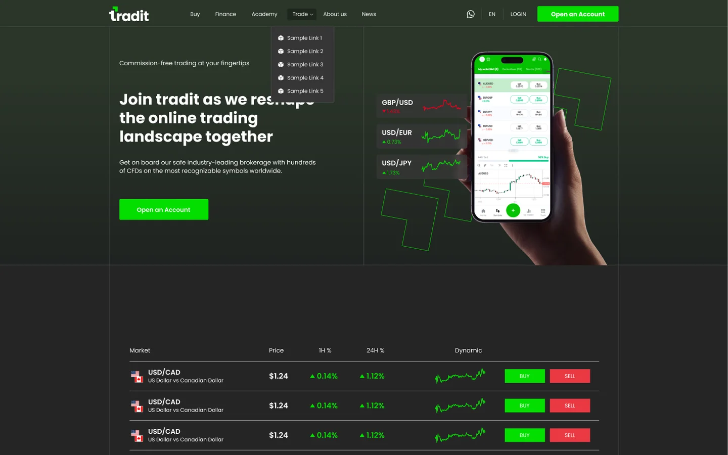
Design file: the dark master's first screen.
01 · The project
The project
The website needed a distinct brand and two visual themes. It also needed continuity between the pages introducing the service and the forms people encounter when accessing it.
I developed the identity, page layouts and theme foundations together.
02 · Design decisions
Design decisions
01
Make theme a property of the components
Surfaces, text and borders reference theme variables with light and dark values. The two themes use the same component structure.
The paired screens show how those values change while layout and content remain aligned. The system uses eight theme tokens alongside four colour constants.
Light · #FEFEFE
Why trade with Tradit
Cost-efficient
Expenses associated with ETFs are typically lower than those tied to an equivalent mutual fund.
EUR/USDEuro vs US Dollar$1.24▲+0.85%BUYSELL
Open an AccountStart trading
Dark · #252525
Why trade with Tradit
Cost-efficient
Expenses associated with ETFs are typically lower than those tied to an equivalent mutual fund.
EUR/USDEuro vs US Dollar$1.24▲+0.85%BUYSELL
Open an AccountStart trading
Eight tokens, re-resolving. The dark half is the same component tree as the light one — the seam is the mode switch, and the greens on either side of it never move.
Reconstructed from the design file · Matching screens using light and dark values from the shared theme system.
02
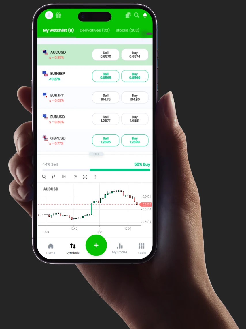
Show the platform in the first screen
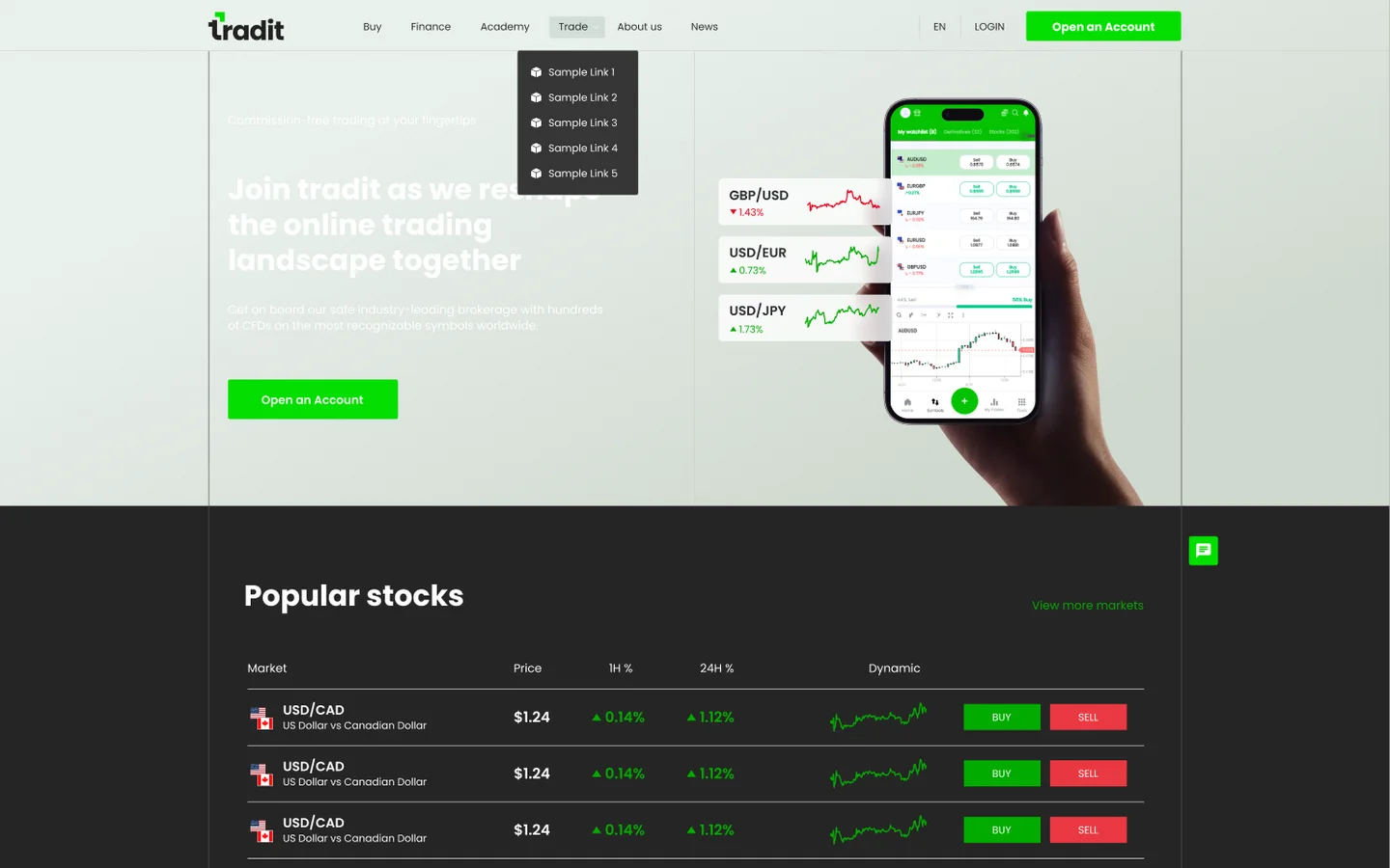
The hero uses a phone showing the trading interface, with instrument cards beside it.
The composition introduces the product visually before the visitor reaches the longer platform explanation. The mobile design adapts that composition to its narrower layout.
Buy
Finance
Academy
Trade
About us
News
ENLOGINOpen an Account
Commission-free trading at your fingertips
Join tradit as we reshape the online trading landscape together
Get on board our safe industry-leading brokerage with hundreds of CFDs on the most recognizable symbols worldwide.
Open an Account
GBP/USD▼1.43%GBP/USD down 1.43%USD/EUR▲0.73%USD/EUR up 0.73%USD/JPY▲1.73%USD/JPY up 1.73%
Reconstructed from the design file · The dark master's first screen: the phone and the instrument cards beside it.
03
Carry the system into navigation and forms
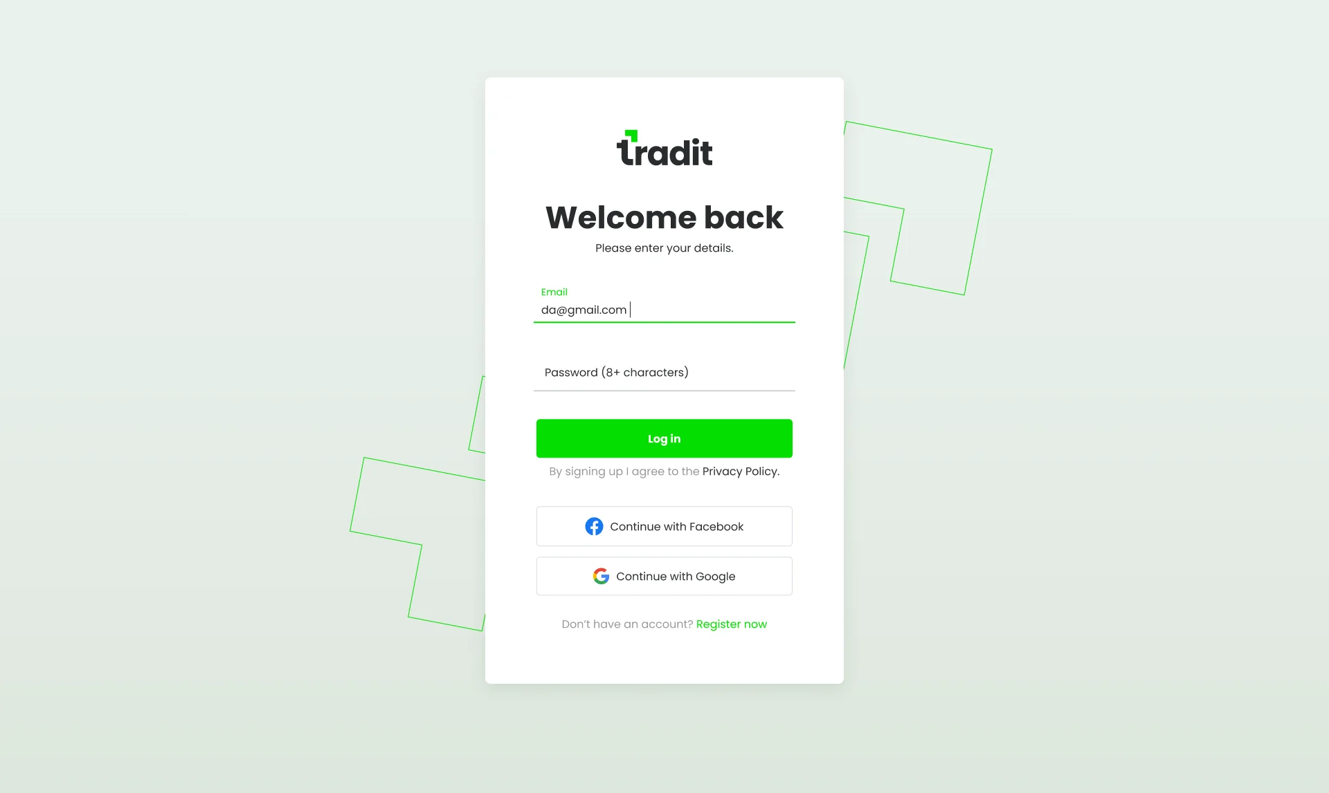
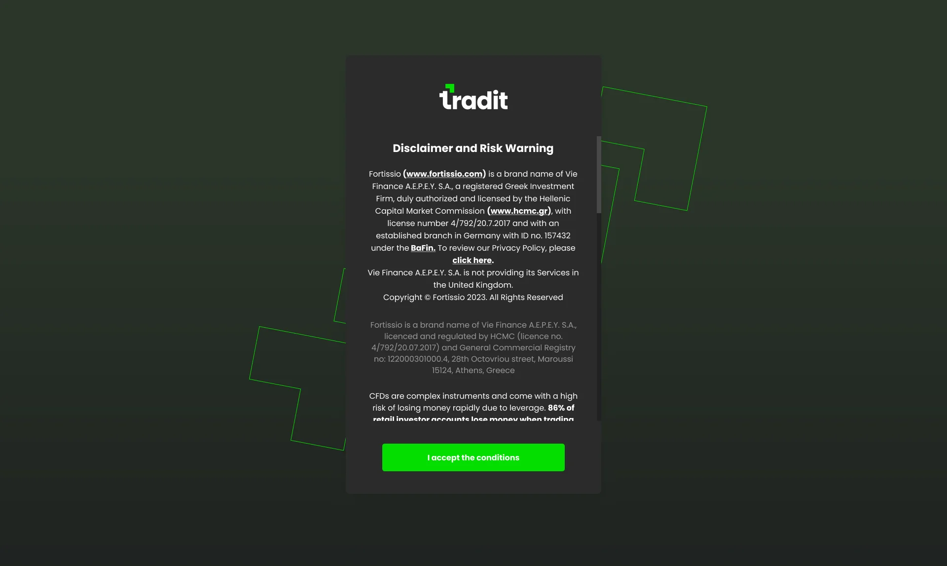
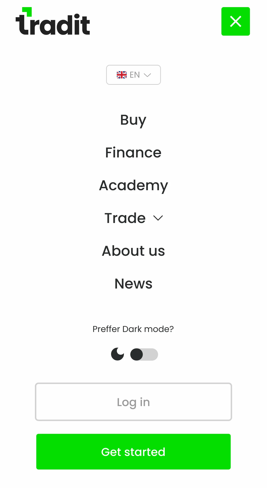
The scope extends beyond the homepage. The mobile drawer, sign-in form and disclosure screen use the same visual foundations, in both themes.
Light
Dark
↔
Design file · Mobile navigation: the drawer in both themes, including account access and the theme control.
Design file · Sign-in design: the component system applied to a form screen.
Design file · The disclosure step, where the visitor must acknowledge the risk warning before continuing.
04
Define the repeated controls
The component kit specifies shared button treatments, input styles, borders and corner radii.
Those details establish a common language across pages and themes.
The kit — 3px · 1px Side Line · no shadows
Open an AccountButton · primary — 214×40 · r3 · #04DE00 · Bold 14 / white
Start tradingStart tradingButton · secondary — r3 · 1px Side Line · hover greens the label
Email addressname@mytradit.comInput · text field — 336×52 · r3 · focus: #04DE00 edge
Reconstructed from the design file · The shared button treatments, input style, borders and corner radii.
03 · What I delivered
What I delivered
A brand identity, a two-theme design system and desktop/mobile screen designs for the website and related account-access screens.
04 · What I would revisit
What I would revisit
The light-mode hero needs a separate text treatment. In the design shown, it inherits white text over a pale background.
I would give that surface its own text tokens and check contrast in both modes. That makes the exception explicit within the system.
05 · Explore the system
Explore the system
Four constants sit outside the theme. Everything else is a token with a light and a dark value, so a mode switch is the only thing that changes.
Brand constants
4
Theme tokens
8 × 2 modes
Corner radius
3px, everywhere
Shadows in the kit
0
+Colour and typography9 colours · Poppins, 4 weights
Brand Green — constant
#04DE00Primary action, accent squares, the footer bar. A surface colour: white over it is 1.83:1, so it never takes text duty.
Signal Up — constant
#03AB00Positive movement and inline links — the system's green for type on light grounds.
Signal Down — constant
#F40000Negative movement, sell actions. 4.3:1 on the page white.
Background — #252525 in dark
#FEFEFEThe page canvas pair. The mode switch swaps this and every token below; the four constants above never move.
Box — #353535 in dark
#FDFDFDCards, panels, input surfaces — one step off the canvas in both modes.
Side Line — #515151 in dark
#D2D2D2Rules, card borders, ghost buttons. The kit's one edge, 1px everywhere.
Sub Text — #D4D4D4 in dark
#51575EBody copy and descriptions. 7.2:1 light, 10.3:1 dark — the reading colour in both worlds.
Ink — constant#212121The wordmark, dark surfaces, the app icon. 16:1 on the page white.
Primary Text — #FFFFFF in dark#2A2C2EHeadings, navigation, values. 13.9:1 on the light canvas; the dark value is 15.3:1 on #252525.
Token names and values read from the file's Website Theme collection and its Colour board; ratios measured against the grounds named beside them. The live stylesheet at mytradit.com self-hosts the same four Poppins weights.
Poppins
Regular
Medium
SemiBold
Bold
One family across brand and product. The geometric bowls and single-storey a carry risk copy at 14px; the Bold cuts hold the display sizes.
H1 · Display · 50/113 · Bold
Optimize your returns
H2 · Section · 40/100 · Bold
Why trade with Tradit
Body · 16/150 · Regular
Exchange Traded Funds track an underlying asset or index.
Small · Risk & meta · 14/140 · Regular
84% of retail investor accounts lose money when trading CFDs with this provider.
+Light and dark, from one masterLight · Dark
Light
Dark
Light and dark, from one masterThe dark page is the light master with the theme collection flipped; the greens are identical in both, because the four constants never re-theme. The light hero keeps white type over a pale ground — the flaw the retrospective below names.

 BUYSELLOpen an AccountStart trading
 GBP/USD down 1.43%
 USD/JPY up 1.73%
 Light
Light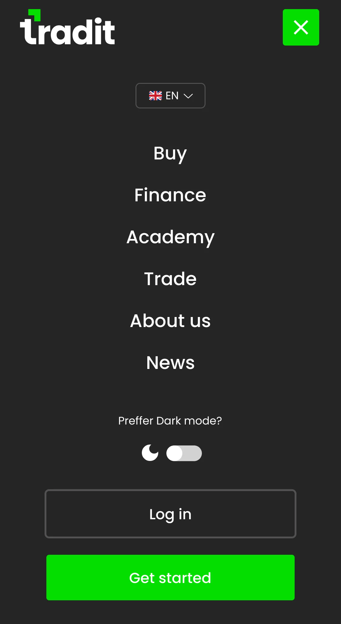 Dark↔
Dark↔