
Finansero
Trading information, structured for the screen
I designed Finansero's broker website across marketing pages, trading information and registration.
The system covers 16 templates at three widths, with shared components for market data, account tiers and the details that need to remain visible around them.
- Role
- Sole designer — UI, UX and design system
- Scope
- 16 page templates at desktop, intermediate and mobile widths
- Delivery
- Design and documentation; implemented by the client's developers
- Status
- Website launched
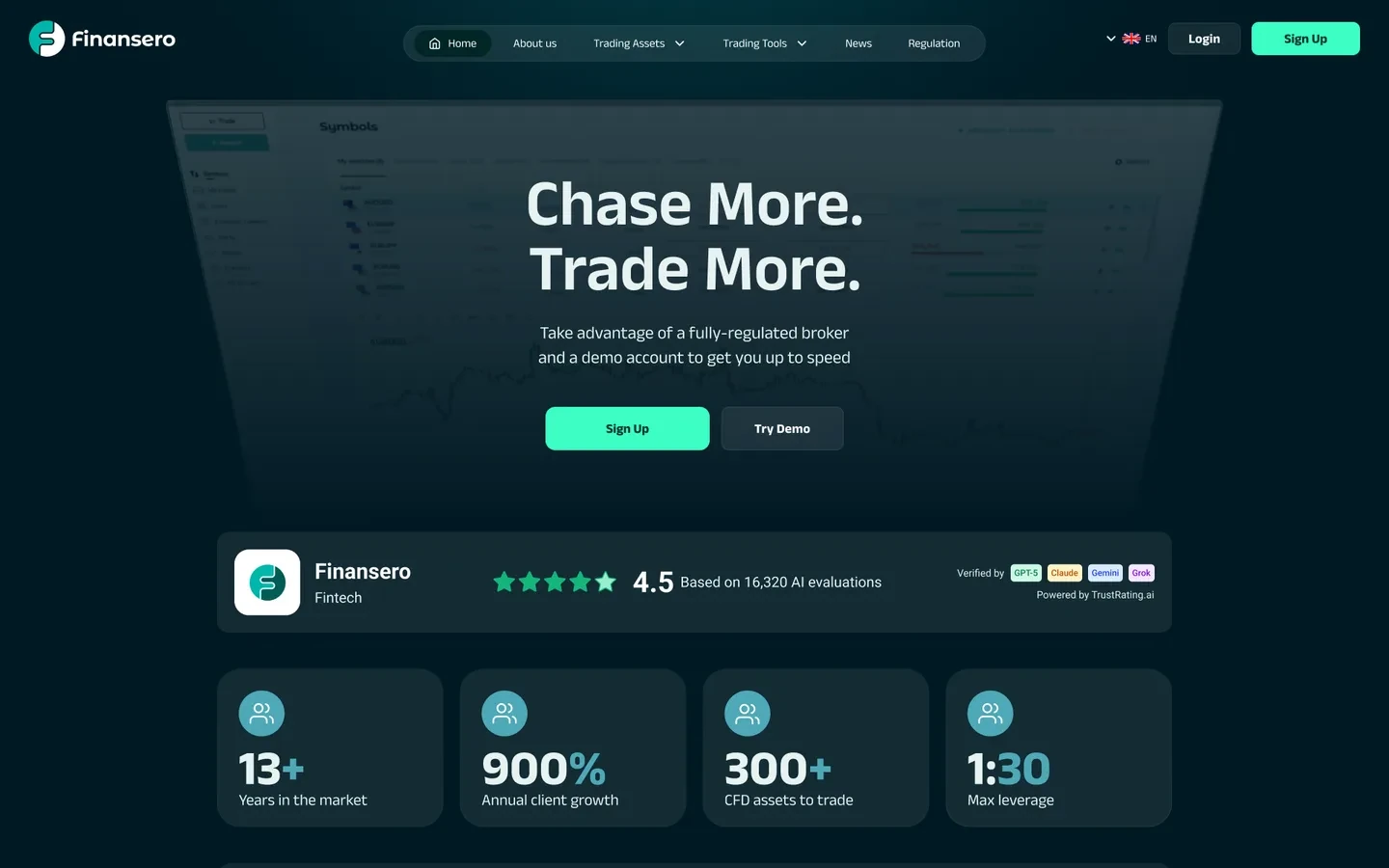
01 · The project
The project
The website has two jobs: introduce the trading offer and present detailed information about accounts, instruments and costs.
Long tables and required disclosures are part of that content. The design needs to give them a usable structure alongside the promotional pages. The costs page is the longest artboard in the file: 5,518px at desktop, 11,048px at 375. Rollover fees are published per instrument, not per class.
02 · Design decisions
Design decisions
- 01
Give long cost tables a way in
The costs-page design keeps instrument-specific information in tables and places a search field above them.
That provides a direct way to look for an instrument within a long page. The table structure preserves the individual rates instead of reducing them to a general marketing summary.
Product Sheets & Costs
The page the regulator sets the length of.
5,518px at desktop, 11,048px at 375 — taller than the homepage at the same width. A search field sits above all of it, because a five-thousand-pixel legal document needs a way in.
84% of retail investor accounts lose money when trading CFDs with this provider.
Search an instrument…CFD PRODUCTROLLOVER FEE- NVIDIA0.1%
- Juventus0.075%
- The Shares group alone lists more than thirty named equities at individual rates, from one of these to the other.
- EURUSD1.2136+0.0016(+0.13%)up (+0.13%)
- TSLA302.83-0.61(-0.20%)down (-0.20%)
Reconstructed from the design file · Instrument-specific tables with a search field above the content.
- 02
Make direction readable beyond colour
Market rows pair price changes with arrows, signed numbers and percentages.
Colour reinforces the direction, but the arrow and numerical sign carry that information too. The same component is reused across the page templates.
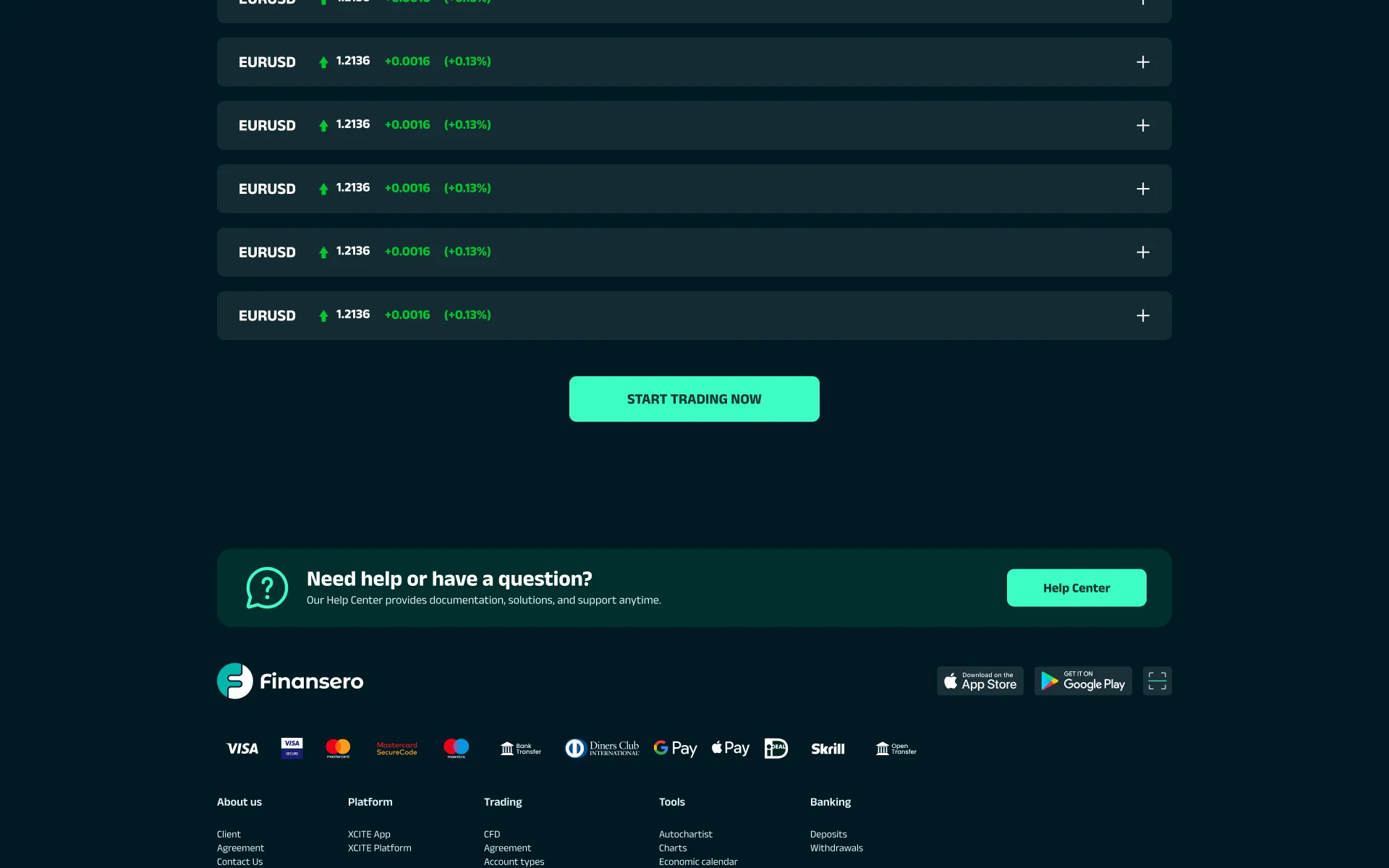
Design file · Direction is carried by an arrow, a numerical sign and a colour cue. - 03
Present account tiers through one shared structure
An equity slider selects one of 12 account tiers. The selected tier appears with its equity range and benefit matrix.
This concentrates the detailed tier information in one component. It also creates a tradeoff: visitors need to interact to see the full offer.
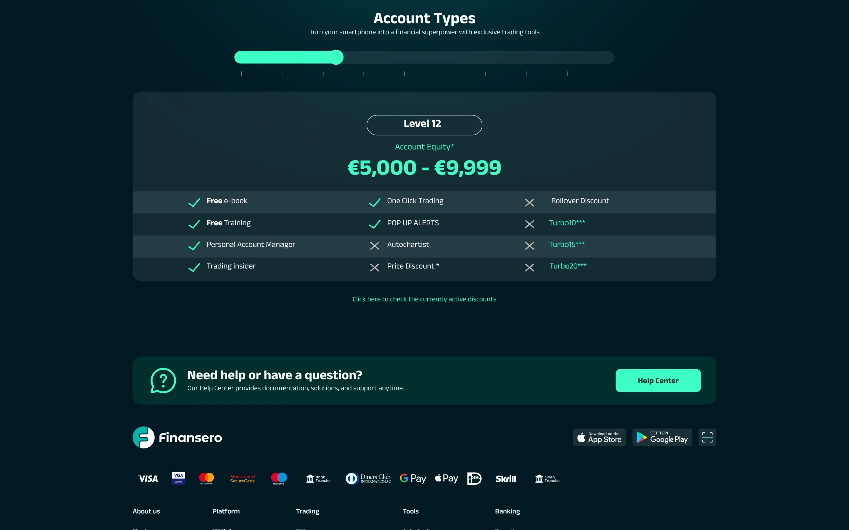
Design file · The selected equity level and its benefits shown in one reusable component. - 04
Specify the layouts at three widths
The templates were designed at 1920, 1199 and 375 pixels. Navigation, actions and content arrangements are specified for those layouts.
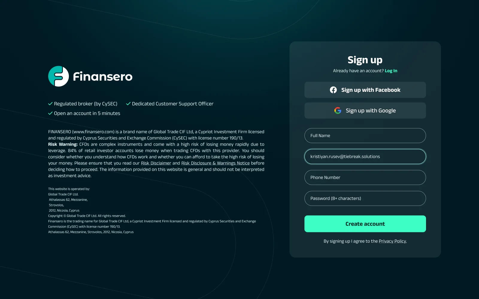
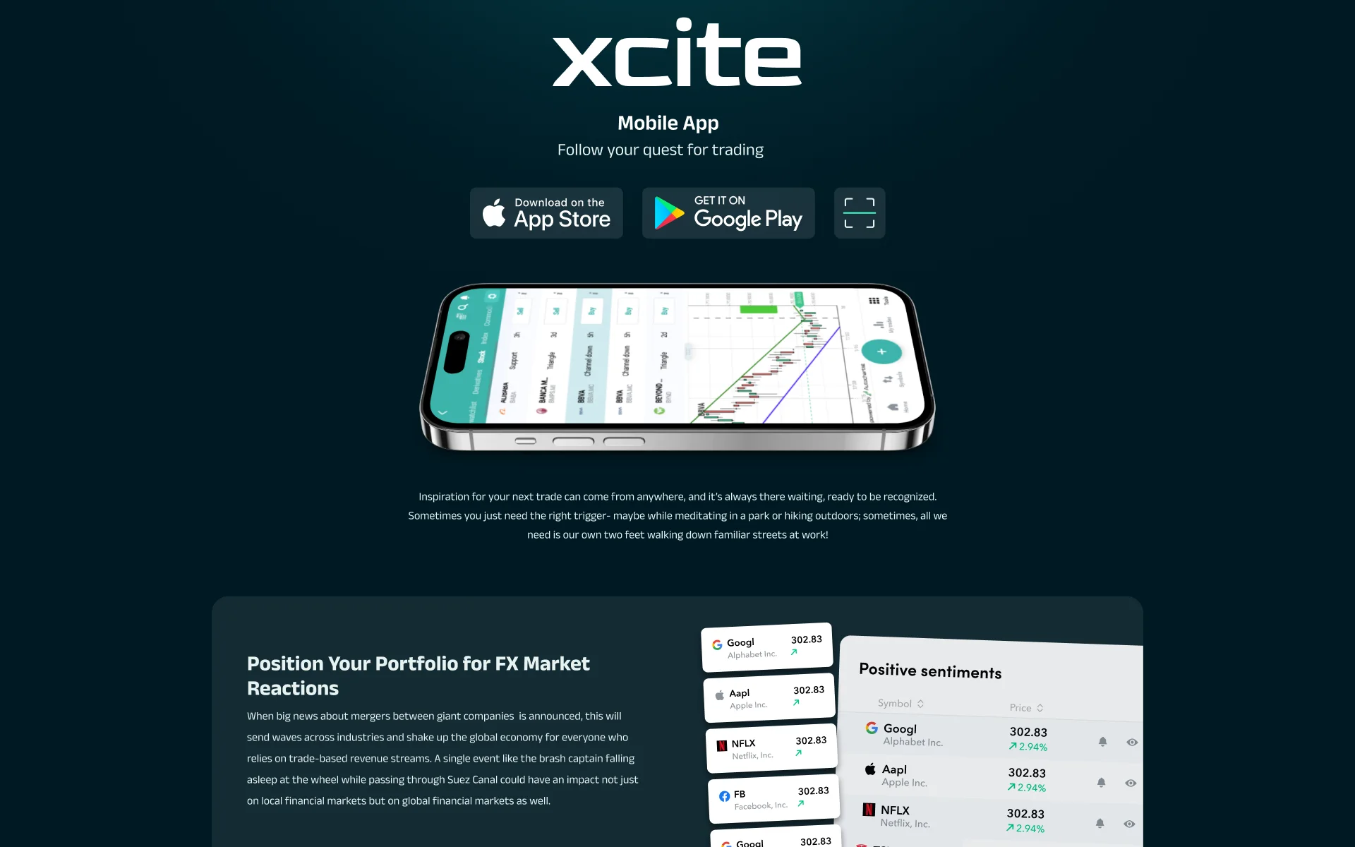
On mobile, the homepage actions stack as full-width buttons. The case study also shows the registration design and pages introducing the web and mobile platform.
Desktop · 1440

Phone · 375
The same first screen at desktop and phone widths. The registration and platform pages are under Full page designs, below.
03 · What I delivered
What I delivered
Sixteen page templates at three widths, a shared design system and the interface designs handed to the client's development team.
04 · What I would revisit
What I would revisit
I would pair the account-tier slider with an overview of the whole range. The detailed view and the overview support different tasks; both deserve a place in the page.
05 · Explore the system
Explore the system
Shared colour variables, text styles and component masters connect the templates. Semantic colour roles reference the underlying values, so those roles can be changed together in the design file. The system detail sits behind the interface examples: it explains how the repeated page elements were organized.
- Colour primitives
- 13
- Semantic tokens
- 15
- Type steps
- 10
- Accent coverage, delivered homepage
- 0.35%
Colour and typography9 colours · Anek Latin, 4 weights
- mint/400 — accent/primary
- #3cffc4Primary action only. 14.01:1 on the page ground, and 0.35% of it.
- teal/400 — accent/info
- #4ea8b7The quiet accent, for stat figures and icon grounds. 5.31:1 on a card.
- mist/100 — text/primary
- #e6f3f1Body copy. Not white — 15.86:1 rather than 18.05:1, which reads softer over long legal passages.
- white — text/heading
- #ffffffHeadings only, so the step from a heading to its paragraph is a colour as well as a size.
- navy/900 — bg/page#001923The ground. 54.22% of the homepage, measured pixel by pixel.
- navy/950 — bg/page-deep#001413The deeper ground under full-bleed sections. 1.47%.
- navy/800 — bg/card#182b34Every card, table and panel. 24.95% — the second-largest area on the page.
- navy/700 — bg/elevated#2d4049One step up from a card, for the thing that sits on one. 4.33%.
- teal/900 — text/on-accent#00322fThe label on a mint button: 10.88:1 against the mint under it. White would have been 1.29:1.
Hexes and token names read from the file's own collections. Ratios computed against the grounds named beside them.
Anek Latin
- Regular
- Medium
- SemiBold
- Bold
Ten steps under one namespace. Line height tightens as size grows, 110% on Display to 150% on body.
Display · 64/110 · Bold
Chase More.
H2 · 40/120 · SemiBold
Product Sheets & Costs
Body · 18/150 · Regular
0.065% of the overnight exposure
Components and states10 colour primitives + 3 alpha · 15 aliases
01 Primitives
The raw layer. 10 solid colours (plus 3 alpha tints, shown composited in the aliases), 12 spacing steps, 5 radii — and the only place in the system where a hex is written down.
- color/navy/950#001413
- color/navy/900#001923
- color/navy/800#182b34
- color/navy/700#2d4049
- color/teal/950#002f2c
- color/teal/900#00322f
- color/teal/400#4ea8b7
- color/mint/400#3cffc4
- color/mist/100#e6f3f1
- color/white#ffffff
Spacing
- 4
- 8
- 12
- 16
- 20
- 24
- 32
- 40
- 48
- 64
- 80
- 120
Radius
- sm · 8
- md · 14
- lg · 20
- xl · 24
- full · 999
02 Semantic
The layer the interface actually spends. All 15 resolve to a primitive; not one holds a value of its own, which is what makes the palette re-pointable from a single collection.
- bg/page→color/navy/900
- bg/page-deep→color/navy/950
- bg/card→color/navy/800
- bg/elevated→color/navy/700
- bg/field→color/alpha/white-8
- bg/banner→color/teal/950
- bg/overlay→color/alpha/teal-70
- text/heading→color/white
- text/primary→color/mist/100
- text/muted→color/alpha/mist-60
- text/on-accent→color/teal/900
- accent/primary→color/mint/400
- accent/deep→color/teal/900
- accent/info→color/teal/400
- border/subtle→color/alpha/white-8
The direction block
The most-used component in the file, rebuilt rather than cropped from a screen. Desaturate it and it still reads.
- EURUSD1.2136+0.0016(+0.13%)up (+0.13%)
- TSLA302.83-0.61(-0.20%)down (-0.20%)
Values read from the file's 01 Primitives and 02 Semantic collections, alpha tokens composited over bg/page.
Full page designsthe homepage, end to end · 3 more pages
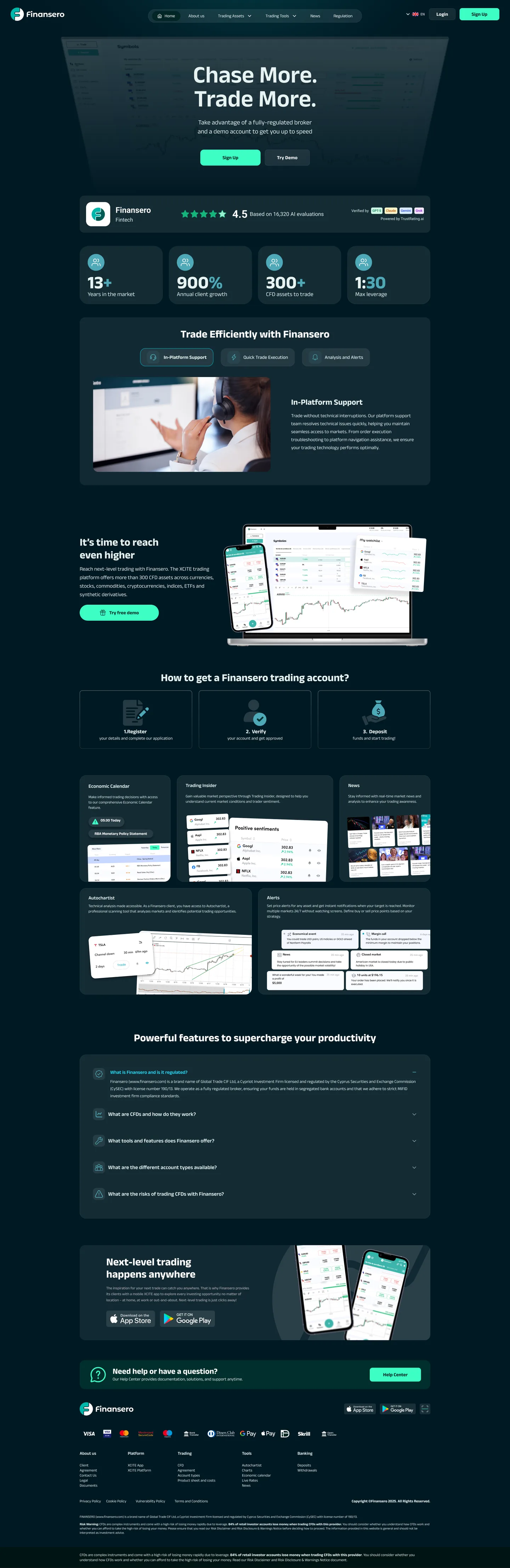
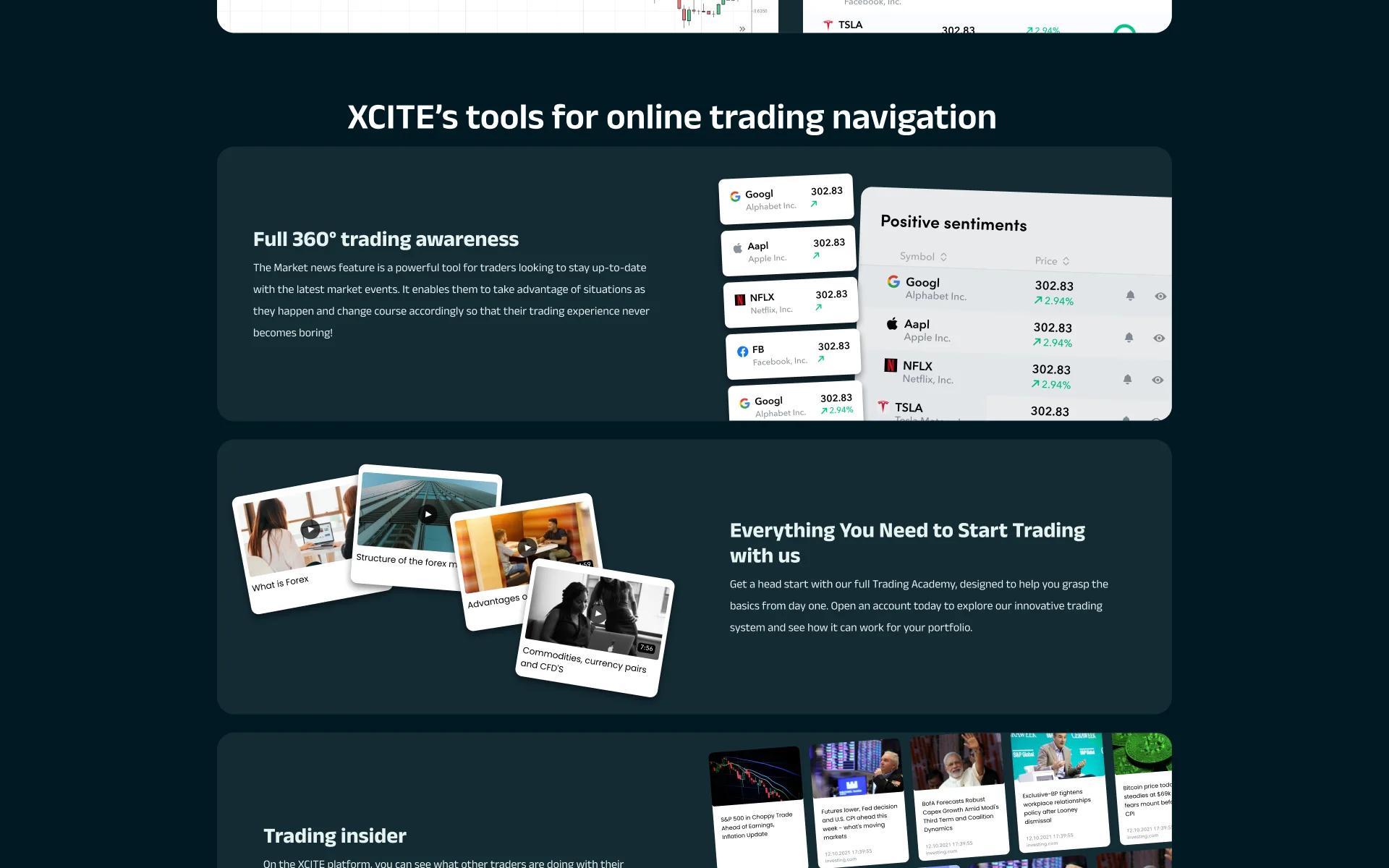
The homepage as delivered, down to the risk warning that has to close every page.
Contact